The online gambling industry is more competitive than ever, with thousands of platforms vying for player attention. In this crowded marketplace, visual design has emerged as a decisive factor that separates thriving platforms from forgotten ones. From color schemes to button placement, every pixel plays a role in shaping user behavior, building trust, and ultimately determining whether a player stays or leaves.
First Impressions: The Psychology of Visual Appeal
Research shows that users form opinions about websites in just 50 milliseconds. For online gambling platforms, this split-second judgment can mean the difference between a new customer and a lost opportunity. A cluttered, outdated interface immediately signals unprofessionalism, while a sleek, modern design communicates reliability and quality.
First impressions extend beyond mere aesthetics. They create a cognitive framework through which users interpret every subsequent interaction with the platform. A positive initial visual experience builds momentum that carries through the entire user journey.
Visual elements tap into deep psychological triggers that influence player behavior. Familiar design patterns create comfort, while subtle animations add excitement without overwhelming the senses. The most successful platforms understand that gambling is inherently emotional, and their visual design amplifies positive feelings while minimizing anxiety.
Premium visual treatments—such as smooth transitions and polished graphics—signal that the platform values quality. This perception transfers to how players view the games themselves and their overall experience.
Color Theory and Player Engagement
Color choices in online gambling platforms are never arbitrary. Each hue carries psychological weight that influences player mood and behavior. Traditional casino colors like red and gold evoke excitement and luxury, tapping into established associations with physical gambling venues.
Meanwhile, blues and greens create feelings of trust and tranquility. These colors are strategically deployed in areas where platforms want users to feel secure, such as payment pages or account settings. The contrast between energizing and calming colors helps guide users through different emotional states during their session.
High-converting online gambling platforms leverage color psychology in their interactive elements:
- Bright oranges and reds for promotional offers and deposit buttons, creating urgency
- Green for confirmation actions, leveraging universal associations with “go” and success
- Contrasting colors for primary actions, ensuring they stand out from the background
- Muted tones for secondary options, creating clear visual hierarchy without distraction
Button color alone can impact click-through rates by 20-30%. The right color choice makes desired actions feel natural and intuitive rather than forced.
User Interface Elements That Drive Engagement
Effective visual design extends far beyond surface-level aesthetics. The structural organization of elements determines whether users can find what they need or become frustrated and leave. Top-tier platforms present complex functionality through deceptively simple interfaces.
Strategic placement of navigation elements reduces cognitive load. Users shouldn’t need to think about where to click next—the visual hierarchy should guide them naturally through their intended path. Intuitive menu structures and quick access to popular games keep players engaged rather than searching.
Every interaction on a gambling platform should provide immediate visual feedback. Loading animations reassure users that their action registered, while celebration graphics make wins feel more rewarding. These micro-interactions seem minor individually but collectively create an engaging, responsive experience.
Progress bars and status indicators reduce uncertainty during transactions. When users can see exactly what’s happening, trust increases and anxiety decreases. Even a simple color change on hover provides essential feedback that the interface is responsive.
Game thumbnails serve as digital storefronts, and their visual appeal directly impacts selection rates. High-quality preview images with consistent styling help users quickly identify games that match their preferences. Blurry or inconsistent thumbnails suggest poor quality games, regardless of the actual gameplay.
Mobile-First Design in the Modern Era
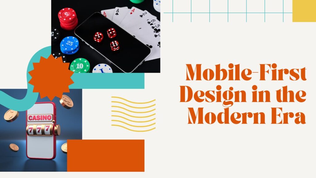
Mobile devices now account for the majority of online gambling traffic. Adapting complex desktop interfaces to smaller screens requires thoughtful visual redesign rather than simple shrinking. Touch targets must be larger, and information density must decrease while maintaining functionality.
Successful mobile designs prioritize the most essential actions and information. Secondary features remain accessible but don’t clutter the primary visual space. This forced simplification often improves the overall user experience even on desktop versions.
Visual appeal must be balanced against technical performance. Key optimization strategies include:
- Progressive image loading that displays low-resolution versions before high-quality assets
- Adaptive content delivery that serves appropriately sized images based on device and connection
- Efficient animation frameworks that maintain smooth performance without sacrificing visual polish
A beautiful interface that loads slowly frustrates users and increases abandonment rates. The most effective platforms achieve both stunning visuals and lightning-fast performance through careful technical implementation. Responsive design must consider both visual adaptation and performance optimization across all devices.
Building Trust Through Visual Design
Visual professionalism directly correlates with perceived trustworthiness in online gambling. Modern, clean layouts signal that a platform is legitimate and properly maintained. Outdated design patterns raise red flags about security and reliability, even if the platform is perfectly safe.
Security badges, licensing information, and payment provider logos must be visually prominent without disrupting the overall aesthetic. Their placement and styling communicate transparency—the platform has nothing to hide and wants users to feel informed and protected. The visual treatment of these trust indicators matters as much as their presence.
Visual consistency across all touchpoints reinforces brand reliability. When colors, fonts, and interaction patterns remain predictable, users develop confidence in the platform. Inconsistency, by contrast, suggests a lack of attention to detail that extends to other operational areas.
Brand coherence builds recognition and familiarity over time. Users returning to a platform should immediately recognize the visual language, creating a sense of comfort and belonging. This consistency extends from the homepage through game interfaces to customer support pages.
Conclusion
Visual design in online gambling encompasses far more than making things look attractive. It’s a sophisticated tool for influencing behavior, building trust, and creating memorable experiences. As technology evolves and user expectations rise, the platforms that invest in thoughtful, strategic visual design will continue to outperform their competitors. The future belongs to those who understand that in the digital realm, perception truly is reality—and perception is shaped pixel by pixel.